Creating a calm and peaceful atmosphere in your home often starts with the colors you choose for your walls and decor. Calm colors can help reduce stress, promote relaxation, and make your living space feel more inviting. If you’re thinking about repainting or redecorating, selecting the right calm colors is an important first step. In this post, we’ll guide you through key tips for choosing colors that create a tranquil environment in any room.
Why Choose Calm Colors?
Colors impact our mood and emotions more than many realize. Bright, intense hues like reds and oranges can energize or even agitate, while softer, muted tones tend to soothe and relax. By choosing calm colors, you can:
– Reduce stress and anxiety at home
– Improve focus and mental clarity
– Promote restful sleep in bedrooms
– Create a welcoming, peaceful environment for family and guests
With these benefits in mind, it’s worth spending some time thinking about the shades and tones that will best suit your space.
Understand the Color Palette for Calmness
Calm colors typically come from a few color families:
1. Blues
Often associated with the sky and water, blue tones evoke feelings of tranquility and stability. Soft blues, such as powder blue or sky blue, are especially calming.
2. Greens
Representing nature, green helps create a refreshing and restful environment. Softer greens like sage, mint, and olive blend well with many styles.
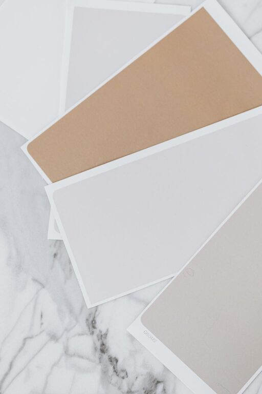
3. Neutrals
Beiges, taupes, warm grays, and off-whites provide a subtle, soothing background that works well throughout the home.
4. Soft Pastels
Light lavender, pale pink, and muted yellows offer gentle color without overwhelming a space.
Tips for Choosing Calm Colors for Your Home
1. Consider the Room’s Purpose
The function of a room influences which calm colors work best. For example, bedrooms benefit from soft blues or greens that promote relaxation. Living rooms can handle warmer neutrals or gentle pastels that encourage conversation and comfort.
2. Use Color Swatches and Samples
Before committing, test large paint samples on your walls at different times of day. Lighting changes how colors look; natural sunlight differs from artificial lighting and can affect the perceived tone.
3. Think About Color Temperature
Warm colors (with yellow, red, or orange undertones) feel cozy, while cool colors (blue, green, purple undertones) feel more serene. Decide if you want a warm calm or a cool calm, depending on your mood preference.
4. Balance with Neutrals
Even calm colors can feel overwhelming if used excessively. Balance them with neutral shades—white trim, beige furniture, or natural wood tones—to create harmony.
5. Use Matte or Low-Sheen Finishes
Glossy paint can reflect harsh light and distract from calmness. Matte or eggshell finishes absorb light softly and maintain a soothing look.
6. Incorporate Textures and Natural Materials
Colors don’t work alone. Use fabrics, rugs, plants, and wooden furniture in complementary calm shades to enhance the peaceful vibe.
7. Avoid Overly Dark Shades
While some dark colors can add depth, very dark shades may feel heavy or confining. If using darker calm tones, balance them with plenty of light and airy accents.
Popular Calm Color Combinations
Here are a few combinations that consistently create tranquil spaces:
– Sage green and warm beige
– Powder blue and soft gray
– Creamy white with pastel lavender accents
– Muted mint green paired with light taupe
– Soft blush pink with warm ivory
Additional Ideas for a Calm Home Ambiance
– Use plants: Greenery naturally boosts calm and connects your space with nature.
– Keep clutter minimal: A tidy environment supports mental calmness.
– Soft lighting: Avoid harsh overhead lights, opt for lamps and dimmers instead.
Final Thoughts
Choosing calm colors for your home is a wonderful way to promote peace and relaxation. Remember to think about the mood you want to create, experiment with samples, and balance colors with texture and light. With these tips, you’ll design a home that feels just right for unwinding and enjoying everyday life.